So, you have your business data and you want to get “insights” from it? Let’s get busy learning how to go about it.
Insights – the misunderstood term?
Let’s first understand what we mean by insights. Let us say that you run a business. The number of moving parts in the said business might be manifold. Each component in itself is nuanced and to get expertise in each component is not possible. So, an insight would mean that you get a better awareness of any one or many of these components. These insights would then equip you to make better decisions for better business.
The easiest way of to understand parts of any business is the quantitative aspect of it. You just collect a bunch of data and that will give you a general idea of what to look at, what things are good, what things are bad, what things can be improved upon. It will give us the feel of how the organisation is doing in the said components. But we cannot look at raw data to come to a conclusion. What would be of immense help is figures and charts. Figures here would mean Key performance indicators and charts would mean visualization that we create using the data. It also points to the right direction to look at, to make the organization grow.
For data visualization, the array of visualization tools on the market can do wonders at analysing data and consuming it in a user friendly way. The learning curve on these things are particularly shallow. Especially Power BI. Numerous options in charts combined with the terrific connectivity to different data sources makes it the best Data Viz tool on the market. Let us see how to quickly set up such a set up in effectively 10 minutes or less.
Getting started with Power BI
If you are using Windows, you can download Microsoft Power BI desktop from the Microsoft store. If it you are using MAC OS, then you can get it from the apple app store.
Once you dowload and run the application, you will get the screen below. For now, we are just going to connect a sample sales records of a super store, available in this site. I am going to use only the top 100 records and create a few quick visualizations to show how it can be done quickly.
https://community.tableau.com/s/question/0D54T00000CWeX8SAL/sample-superstore-sales-excelxls
You can see the get data option on the top which offers connections to almost any data source that you can think of.
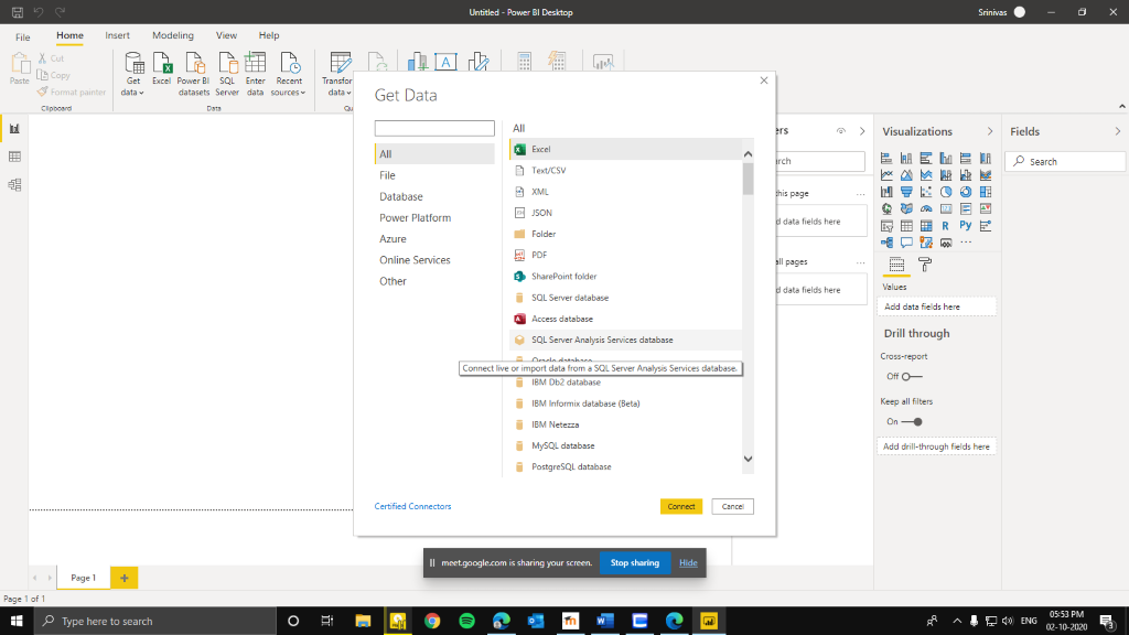

Select the Excel option on the get data, and find the file that you want to analyze, I am selecting the Sales superstore. You can select the table that you want in the excel file and click okay to find the data loaded. Power BI is smart enough to identify the data type of each attribute and thus makes it easier to create charts with it. You will realise that the flexibility of the powerful tool when it comes to the date values. It recognizes and then allows you to visualize the data in days, months, quarters and years if you want. That’s a powerful feature and saves a bunch of time from formatting each field. If the data is clean, it makes the job easier. Once the data is loaded, you can view it in the data tab on the left panel. You can also see the list of variables from the excel sheet on the right side under fields.
Quick Visualizations
Now that we have the data, lets make a few quick visualizations. Let’s go with the obvious ones first. Profits, across regions. Select the bar chart on the Visualizations gallery on the right. You can drag and drop the attributes from the fields on the right. Now, if you drag and drop profit from fields to values, and region variables in the axis field, you will get something like this.

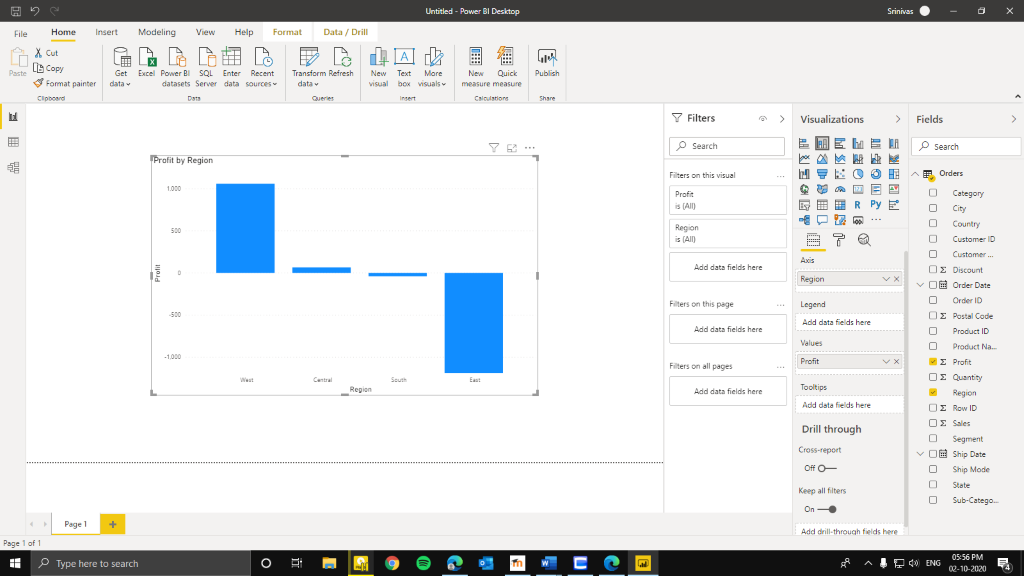
From this chart, we can understand that west has been the most profitable and East has been doing pretty bad on the profit side of things. We can find out the exact figures by clicking on the format tab below the visualization gallery and turn the data labels on.
To further deepen the understanding of the profits over time, we can make it into charts and line graph which is the second last on the second row of the visualization gallery. Now push the region into column series. You will get something similar to the image below.

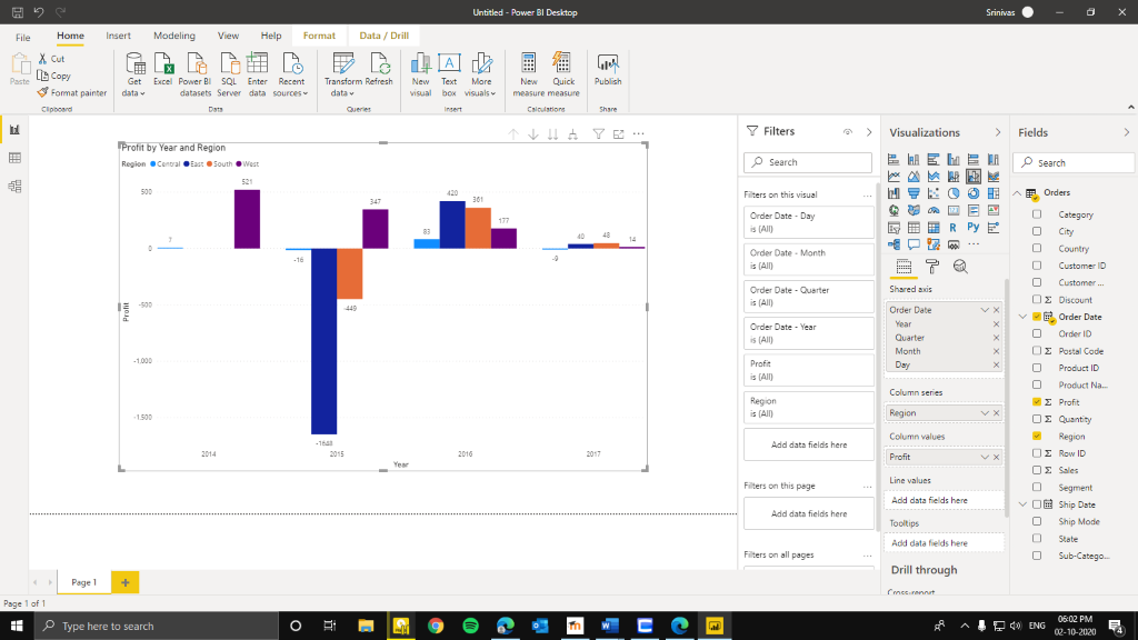
From the early chart, we knew that the profits were low for East region, but now witht this above chart, we realise that there was a massive loss in 2015. Profits picked up in 2016 and dropped again in 2017. To understand why there was such a drop in year 2015, we have to understand the business of Eastern region. Therefore, we can understand the movement of profits across time across regions.
Now, let us see another example. We create a new page by clicking the plus on the bottom of the screen. Now let us see how the distribution across the categories of products by the supermarket. Select a pie chart from the visualizations gallery. Drag quantity field to the values and categories field to the legend. Since it is a drag and drop interface, you can move the chart and resize it.
We can see that the office supplies have been the most sold category in their products(59%) and furniture the least(14%). This gives us a clue to that the sales of furniture needs to be improved and business decisions needs to be made using that. Let’s create a similar chart but with doughnut chart and add the profit field in the values. This gives us the distribution of profit across categories.

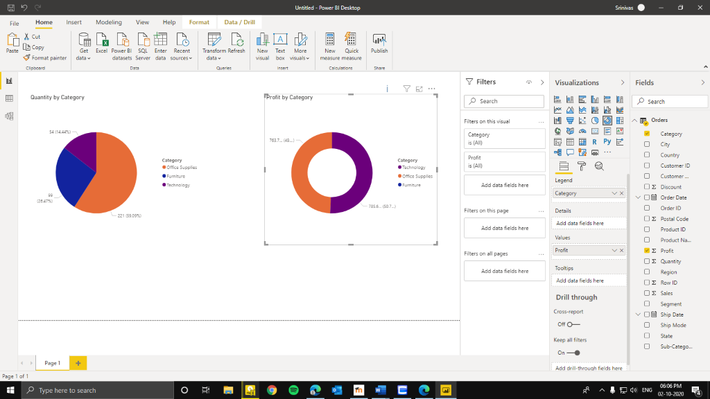
This chart tells us that the furniture has not been yielding any amount of profit and thus further strengthening the argument that the sales of furniture must be improved vastly, both quantity of sales and the turnover gained from it.
Conclusion
By this exercise, we realise that a good data visualization can be created in very short amount of time using data visualization tools, in this case, Power BI given that the available data is cleaned and in a format that is easy to use. This helps us get insights to improve the business by showing us the strong and weak areas and points us to the direction of concerns and therefore giving us the opportunity to grow in the places that the business stagnates.


