Less is More.
Creating a Robust Dashboard with crisp Report visuals is pivotal for quick consumption of relevant data for faster Decision making. The Outliers need to stand out! Data needs to be aggregated and presented in the best way possible to ensure Zero learning curve.
Imagine you are a Sales Manager who wants to create a Dashboard for Senior Leadership. The Senior Management is interested in viewing:
- Profits per Chain per Region
- Profits per State
- Total Profit accumulated till date
- Total Cost per Chain for a specific period
- Cost performance per state
- Total Cost accrued for a specific Financial Year
- Total Revenue per Chain per Region
- Total Revenue accumulated per State
- Total Revenue accumulated till date
A great way to showcase all these parameters through minimal visuals is to create a slicer based on all the parameters that the business users are interested in and leverage the slicer for creating dynamic visuals based on the selections made.
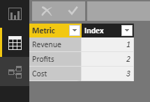
Assumption – You have already created Measures to calculate Total Cost, Total Profit and Total Revenue.Step 1 – Create a new Table [say Metric Selection]
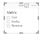
The Metric Column will be used for creating a Slicer on the Reporting Canvas, which will filter the reports accordingly. Ensure that this table does not have a relationship with any table.
Step 2 – Create a New Measure to capture the selections of the above Metrics [based on the Slicer selection]
In this case a measure named Metric Selected has been defined. If there are no selections made, power BI, by default will display the visuals based on Total Sales.
Metric Selected = SELECTEDVALUE(Metric[Metric],”Total Sales”)
Step 3 – Create another Measure for leveraging the selected metric for creating corresponding visuals.
Switch () function has many advantages over IF () Function – mainly it is much easier to write and understand. Also, it has a single closing parenthesis.
Step 4 – Create a Slicer on the Reporting Canvas based on Metric Column
Step 5 – Start Creating your visuals
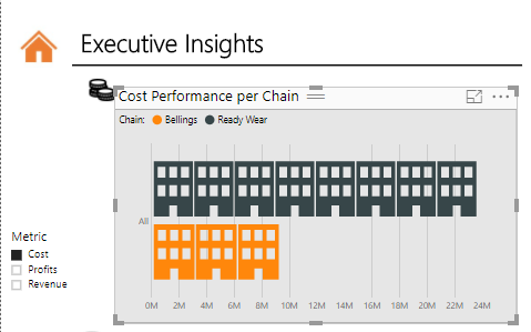
You could create a simple Bar chart and build this visual on Chain and Selected Metric Measure. Infographics Custom Visual can be used to represent data in a fun way. For instance, on Selection of Cost Metric, the end user will be able to view the Total Cost per Chain.
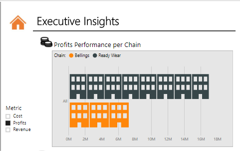
Similarly, on selection of the “Profits” Metric, the visual will change accordingly to reflect the Total Profits per Chain. Note – The title also changes dynamically based on the Metric selection.
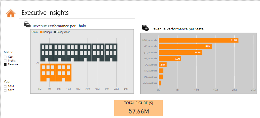
On selection of the “Revenue” Metric, the visual will change accordingly to reflect the Total Revenue per Chain.
Another Visual can be created based on Selected Metric Measure and State. This way, when the end user selects a Metric, the visuals will change accordingly. Therefore, the Business User, in a single snapshot can view Total Cost, Total Profits and Total revenue related visuals automatically, without having to toggle between tabs or Reports. You could also add separate measures for generating Dynamic Titles to these visuals based on the Metric selected. Below is a quick snapshot of the final output.
Conclusion:
There is no denying that Designing a great Dashboard is an art and science. Creating and leveraging multiple metrics to present pertinent data intelligently will ensure a great user experience and enable faster data consumption and Insights driven decision making. Dynamic Visuals also help reducing Information overload and confusion on your dashboard thereby making your storytelling fun and engaging for the time-starved senior leadership.
Stay tuned for more learnings.


