Data visualization is a technique in which information/data is represented in a pictorial form such as map or graph. It is much easier for human brains to comprehend information through visuals than rows of data.
With large variety of tools present in the market, it is extremely easy to create a fancy and impressive visualization with your data. Right from simple pie chart to adding animations, colors, fancy labels, 3D images you can create intricate visualization in no time. Data Visualizations is the most compelling media as we are in an inherently visual world.
Like with great power comes great responsibility. Similarly, with so many options available in Visualization package it is very easy to get distracted from impact or mislead and confuse audience by creating a visualization which can mislead the user by using enormous range of effects available in the package.
To create an ideal visual content a lot of work is required. Charts/graphs, when created hurriedly, are often more harmful than helpful. In engineering a good data visualization is a process of reduction i.e. removing clutter that is not relevant to the point you need to convey.
5 Simple hacks to create effective visualization:
- Chose the right type of chart for representation of data. It will help you find and tell story in the data. The appropriate chart reveals patterns and trends, so you instantly understand the significance of the data set that you’re visualizing. If you know what you want to show, and you have data then there is a perfect chart for you.
- When it comes to communication always remember less is more. “Above all else show the data”. Erase everything you do not need. Software programs often come with way too many borders, lines and unnecessary ink. Delete the built-in chart junk. Remove also all the ‘chart junk’, such as non-standard fonts, excessive use of colors, animations, icons, and other distractions. Remove redundancy (the same data point represented more than one way). Experiment with removing “metadata”, such as grid lines, labels, trend lines. Avoid using 3D charts.
Every element should have purpose and should be justified to be on the dashboard and tell a separate story. Anything which do not add important information should be removed from dashboard.
- Format your charts to make them easier to understand and more aesthetically pleasing. One of the methods can be use of colors. Data can be represented by colors. Use colors to highlight different categories or to represent a secondary metric on your chart. Be careful: Color used poorly can conceal insights and confuse people.
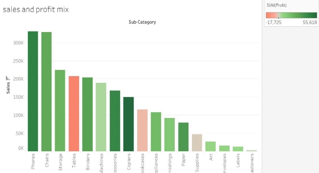
In this chart Profit/Loss is shown by the color.
Green = Profit
Red = Loss
- Highlight what is important. Direct readers attention to what is important. Make critical insights and data points stand out by directing audience’s attention to what’s important. Directing attention with conditional formatting, reference lines or trends and forecasts increases the ‘dwell time’ of reports, leading to a better understanding of the significance of data.
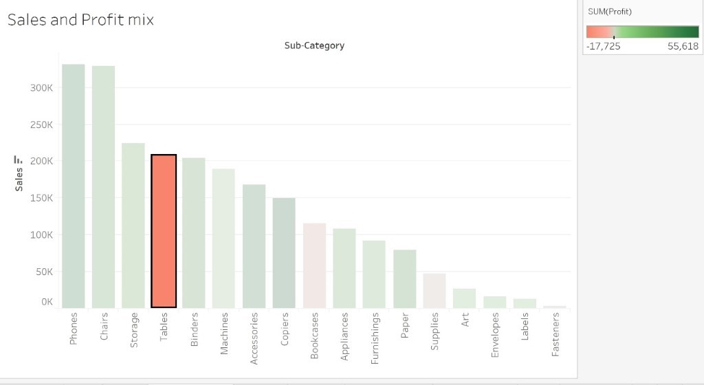
As we are trying to find the category, which is running in loss, driving attention to tables bar will give reader more focused view.
- Data Ink Ratio : According to Edward Tufte, tables and graphs consist of two types of ink Data ink : Ink used to display data and Non – data ink : Ink that is used to display anything that isn’t data. Hence as per the Data Ink Ratio concept the ratio of ink used to display data to the total ink used should be high.

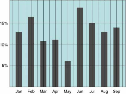
Low Data Ink – Bad

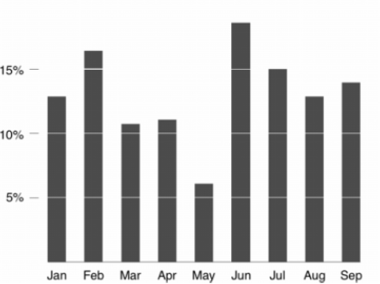
High Data Ink – Good
Data visualization is not just charting or graphs, it is the art and science of storytelling with real conflicts, heroes, and conclusion, which is hidden in data. Based on which real actionable insight can be unveiled. So, a series of small, intentional edits can completely transform your visualizations. It is a competence like any other, and even experienced practitioners could gain from honing their ability in the topic.


