From hoardings to social media to reports to advertising, today’s world is more visual than ever. As our brain absorbs and processes images 60,000 times faster than text and 90% of information is stored in pictorial format in our brain.1
With the massive development of tools for Visualization, the choice of appropriate visualization has become an extraordinarily complex process. Though tools provide generic charts/graphs, sometimes it becomes difficult to present a clear evaluation. Hence, we suggest use of Annotation. It is narrative/text on chart, which is not a label, header, or title.
Annotation – the essential component of visual/spatial data-driven storytelling.
Whenever there is complex chart/graph, and is difficult to comprehend, I would suggest adding an annotation. It will help drive the viewer’s attention to the critical point in the chart and will retain the attention span of the reader. If there are multiple charts/graphs, and you annotate on each sheet, then you are driving the story telling, rather than reader interpreting the story.
Annotation acts as an interface for data and communication. But many analysts think that it adds clutter to the chart. If used wisely it becomes an essential part of the storytelling.
It is mainly used in explanatory analysis, where you can highlight the critical analysis. The annotation in the chart should always be visually appealing and informative.
How to add Annotations in Tableau
As annotation is a great addition to charts lets learn how to effectively add it in Tableau.
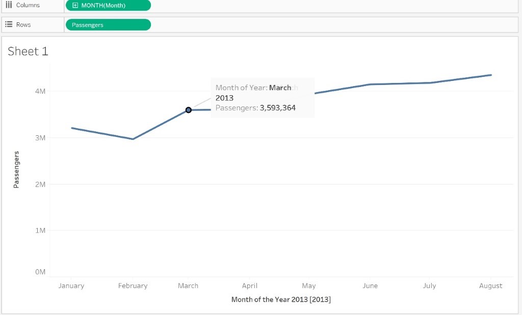
Once you have built your Visualization you can add annotation to your chart. You can either add annotations on your worksheet or dashboards to call out a specific mark, a specific point, such as a location on a map, or an area, such as a cluster of scatter marks.
To add an annotation to your visualization:
- Right-click on a data point in your worksheet, or on a spot on the chart, where you want to add an annotation. Select Annotate, and then select the annotation you want to add.
Tableau provides three different types of annotations:
- Mark – If you want to add an annotation that is associated with selected mark. When you select data point, then only this option is available.
- Point – If you want to annotate a specific point in the chart, select this option.
- Area – If you want to annotate an area in the chart, such as cluster or any region, then select area.
- You can edit the Annotation after adding it. Click on Edit, then the dialogue box opens up, type the text you want to add to annotation.
- You can insert dynamic variable too in the Annotation text. It will display dynamic variable value depending on the changes made to the underlying data.
- When finished, click OK.
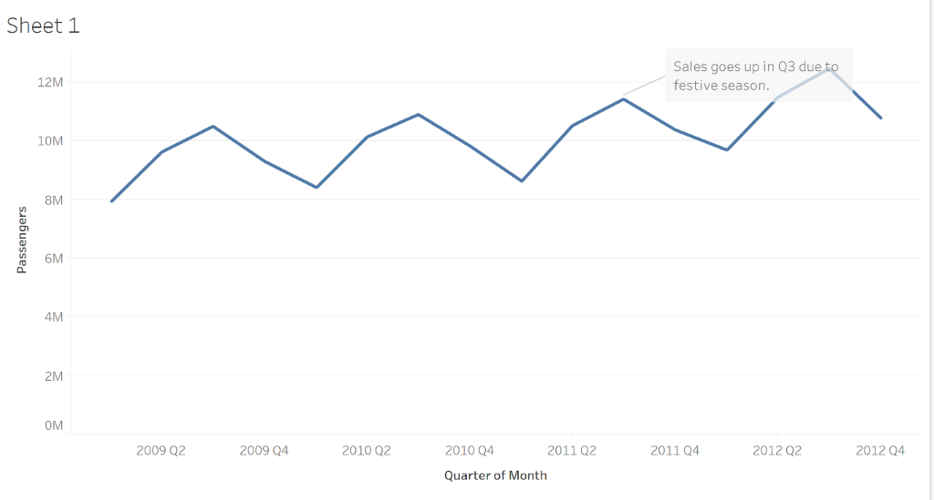
The visualization updates with your annotation.
The below example is of Mark Annotation.


How to edit an existing annotation?
To edit an annotation:
- Right-click on the annotation in the visualization and select Edit.
- In the Edit Annotation dialog box that opens, edit the annotation text and then click OK.
Rearrange an annotation
After adding an annotation, you can adjust the placing of it, i.e. can move it around, resize it, adjust the line, and move the text. Each type of annotation can be rearranged and modified in different ways.
Conclusion:
Annotation are great ways of adding small and brief observations on a story board, which helps the reader comprehend the story better and understand the creator’s point of view. If there are sudden decrease in sales, you can specify the reason in an annotation on the chart. It will instantaneously help the viewer understand that the dip was due to holiday season, and there is no cause of concern.
Reference link
[1]https://killervisualstrategies.com/blog/how-our-brains-are-hardwired-for-visual-conte


